
Traditional Art

Definition of the Medium
Gouache is similar to watercolor and acrylic. But it has unique characteristics that differentiate it from both of them.
Like watercolor, it's water soluble and its binder is gum arabic (M. Graham & Co use honey ιn their gouache). The pigment ratio however is much higher compared to watercolor. It's also opaque (containing chalk). However, it can be thinned down to washes and worked just like watercolor. In that form it's less translucent than watercolors but you'll have a hard time to tell the difference. Most importantly it can build up opaque layers.
When it dries - like acrylic - the lights tend to be a bit darker and the darks a bit lighter. It dries fast and flat. Although - unlike acrylic - the opaque layers of gouache can be reactivated with water. Despite the matte look, gouache has a special vibrancy in opaque form due to the high pigment load.
If you work in watercolor, you can try adding just white gouache to your palette.
Did you Know?
Adolf Von Menzel, Anders Zorn and J.S.Sargent were masters on incorporating gouache on their works with telling results.
So let's sum up the characteristics of gouache:
♦ It's opaque
♦ It dries fast, flat & matte
♦ It changes value when it dries (lights darken & darks lighten)
♦ It gives hard edges
♦ It reactivates with water
♦ It requires a particular water-to-paint ratio for strategic working.
♦ It's easy to travel with, set up and clean.
With the above in mind, make use of these tips:
On Diluting
- Squeeze the paint on a wet towel to prevent it from drying on your palette before you use it. You can water spray it to keep it fresh alternatively. - Why? Can't I reactivate it and still use it?
- Yes you can, but the reactivated paint will be thinned down and will lack proper body to work with opaquely.
On Mixing Strategies
- Use the right amount of water-to-paint ratio so the opaque layers can be reactivated and be blended together. If not then it will leave a weak spot, a stain.
- When mixing, be aware of the value shift that will happen.
With time you get use to it. If the change is dramatically big and bothers you, then the issue is in the water to paint ratio. - "When you go to mix a color, mix the HUE first, then the VALUE, then the CHROMA." ~ James Gurney
On the Process
- The drawing will get covered as you build up opaque layers.
- Work in tiles with precise value control. They create the form. Glaze with water and blend lightly between the tiles to get rid of the hard edges if you want.
- If you apply a new layer to a half dry layer, they will blend together. Allow them to dry thoroughly.
- When you apply a darker layer on top of a lighter layer, the previous layer (depending on how much pressure you apply and how much wet the new layer is) will reactivate and affect the new layer on top of it.
- For this reason be decisive, mix thoughtfully, apply brushstroke and leave it.
- Big area gradations are hard to achieve in gouache. So prepare big paint piles beforehand. Work in transparent washes for soft gradations.
Avoid
- Over-blending. Also be careful not to lift paint with the brush - unwillingly - when you reactivate layers.
- If applied impasto, gouache might crack on a flexible surface.
Begin Simple
Gouache is a very crafty medium and requires very disciplined execution.
For this reason it's wise to start practicing gouache - like any other medium - on monochromatic studies. Also practice on simple shapes, on solids.
First I'll demonstrate a sketch study of a grey wooden cube from life, in black and white.
What you'll need:
- A cup of water to clean your brushes
- Brushes (for this one I'll use just a synthetic flat no.8)
- Black and white paint (I use Winsor & Newton, Permanent White & Ivory Black)
- White Palette (porcelain works best)
- Paper towels (I use bath towels, they last way more and I avoid wasting)
- As a painting surface you can use: watercolor paper, heavy paper, canvas, illustration board, gesso and anything that doesn't buckle easily (I'll use Bristol paper for the following demonstrations)

Monochromatic Study
1) Drawing
Sketching the cube. Don't be afraid to make the drawing more bold, you'll loose it later anyway.

2) Stains
I start by using gouache like watercolor and stain the surface for some base tone. Getting rid of the white to work opaquely. From darks to lights, like in oil.

3) Shadows
I start blocking in the shadow plane of the cube. At this point I should have mixed the lighter reflected light at the bottom right away, but I'll do that later on top. Sorry.
I also blocked the cast shadow on this step but it's on the next image.
I'm keeping my mixtures in a certain consistency of water and paint, so I can work the same and reactivate them later with ease if I need to.

4) Halftones
As you can see, I moved to the plane on the light side, but it doesn't get lit much. Halftones will give you the most trouble in gouache due to the value change, as we spoke earlier.

5) Lights
I moved to the lightest plane and mixed the right value. Once that dried I applied the highlights on the edges of the cube. So I use the edge of my flat brush and paint the ridge that catches the light.
At this point I visit the cast shadow and mix a dark mid-tone for its edges since it's not razor sharp.

6) Reactivate & Finishing
Here I visited the shadow plane and added the reflected light (which I should have done earlier). This way the core shadows at the edges between light and shadow become instantly darker, so I don't need to underline them any further.
I also darkened the occlusion shadows, right where the cube sits, really thinly.
Clean your brush thoroughly. Water glaze over the edges and blend where necessary. I thrown in a wash to the foreground so it won't be boring to death.
Although, you don't have to do any blending. You can work with strategical tiling and it still will look great. That's gouache, Fred Fixler knew:

And this sketch study is done.

I did a second one and raised the local value.

These simple studies will be the solution to your problems. If you can't solve the various issues here then it's less likely that you'll do in more complex and demanding works. So it's always a good habbit to practice on simple ones.
But we're not done yet. Let's apply what we learned into a more complex subject!
Sketching a Head
As you know, the head is a combination of spheres, cylinders & cubes.
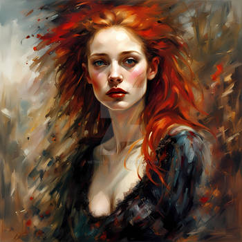
I chose a female head for this one. Females in gouache are difficult to do due to their rounder features as opposed to males. I'll try not to mess this one up.
- Pssst... with sunglasses on so we get away with less work!
- OK!
For this one I'll use the Zorn Palette plus some more colors:
(Permanent White, Yellow Ochre, Cad. Red, Ivory Black + Burnt Sienna, Viridian, Ultramarine)
As for brushes I'll use just a mid-size round no.6 & a 1 inch flat.

1) Drawing
Make sure it's OK and then proceed.

2) Stains
Like before, dilute the paint to washes and lay some base tones.

3) Shadows (Hair)
I often start off by finishing the hair first and then move on to the rest. Her hair is blonde.
So I lay in the darkest darks to begin with. I use tiles, just shape with the brush.
(Red/B.Sienna + Y.Ochre + Black)
As for color temperature, the shadows here are roughly warmer and the lights are cooler compared to them. You can only judge color temperature based on what surrounds it. So we can't be dogmatic about color temperature. Color is relative to a number of factors. Observe and ask yourself "is this warmer or cooler than this?". It's never just "warm" or "cool". It's always "warmer" or "cooler" compared to something else in the same frame.
Remember
Change of plane = Change of Value + Change of Color Temperature

4) Halftones (Hair)
Continuing with the halftones on the hair. Top is darker and it lightens as it goes down.
I don't get crazy about it, I simplify to a great extent and avoid copying everything I see.
(Red/B.Sienna + Y.Ochre + Black + White)

5) Halftones to Lights (Hair)
Transitioning to lights. Increasing in chroma a bit here. I liked the hair a bit muted in the lights, so I kept the highlights low in value. This was a personal preference not a suggestion you should follow.
(Red/B.Sienna + Y.Ochre + White)

6) Shadow (Face)
I start off by blocking the shadow side on the face and the glasses. Form shadows to reflected lights to cast shadows. Warmer and a bit cooler as I move down.
(Red/B.Sienna + Y.Ochre + Black + White)

7)Halftones & Lights
Beginning from the edge of the shadows, I mix the neutral transitions with more black added to the mixture.
(White + Cad.Red + Y.Ochre + Black)
Moving to the halftones, I see that the chroma there is greater.
(White + Cad.Red + Y.Ochre + a bit of Black)
Lights and highlights, which again I kept really grouped together. On the neck my mixtures are cooler and more grey-ish.
(White + Cad.Red + Y.Ochre)

8) Background
I took my 1 inch flat and wet the background with water to avoid hard edges, just like you do in watercolor. Then I wanted to mix a cool color that will reinforce the flesh tones. I also wanted it flat. So I covered the background with a semi-opaque mixture and played around with the surface for variation.
(Viridian + White)

9) Finishing
Now the fun part. Time to reactivate!
I dip my brush in clean water and start to glaze over (lightly, otherwise you'll end up picking up paint) and blend the hard edges. I also reinforce the highlights again as they get a bit obscured by the glazing.
It is normal that you'll go back and forth with the process until you get experienced with time.
Sign it and we're done.
Like always, I'd like to remind you that I'm not suggesting you to paint by numbers. After hard practice you will develop your own way of problem solving. However, make sure that it makes sense and avoid developing bad habits.

Epilogue
If you're considering to give gouache a try, then by all means do. It's a great medium and very dear to me along with oil.
I hope you enjoyed this article!

Other articles by SombrePainter :
- Portrait Painting in Oils